Guide
3 ways to make more of your white walls
by Pia Seidel

Pantone has chosen "Cloud Dancer" as the colour of the year 2026 - a soft shade of white that symbolises calm, clarity and creative freedom. But can a colour that stands for neutrality really inspire?
In 2026, Pantone celebrates the symbolic emptiness of the canvas represented by «Cloud Dancer». The neutral white shade «embodies a longing for peace, while at the same time creating space for new ideas», explains Laurie Pressman, Vice President of the Pantone Colour Institute.
The US company invites artists and brands such as Play-Doh and Post-it to create their own interpretation of the colour. This results in limited editions in graphics, fashion and applied art and shows how colours can inspire and connect people. Each creation highlights how art and design can touch us emotionally and make us think.
However, the idea behind the «cloud dancer» is not only inspiring enthusiasm.
Critics such as SRF culture editor Alice Henkes see «Cloud Dancer» as the «pinnacle of neutrality» and ask whether Weiss is really a revolutionary choice. The political dimension does not go uncommented on either: The Washington Post points out that the choice of Weiss could raise eyebrows in a year full of debates about nationalism, because colours often convey social and political messages beyond their aesthetic function.
The magazine Elle Decor brings in another perspective. Julia Cancilla describes «Cloud Dancer» as a response to society's collective exhaustion.

Design columnist Ulrich Clewing from AD magazine is generally critical of the annual Pantone colours. For him, these trend colours are less an expression of competence and more a clever marketing gimmick that keeps the industry busy every year.
Clewing wonders whether people with taste and style should really be influenced by such a choice - or whether the idea of choosing a colour as a symbol for an entire year is not rather superfluous. His assessment: «There are some quite nice things among them, possibly a few gems and an above-average amount of rubbish.»
Despite the criticism, it's worth taking a closer look. Whether you see the annual Pantone colours as a clumsy marketing strategy or great inspiration, a conscious examination of a colour can always open up new perspectives.
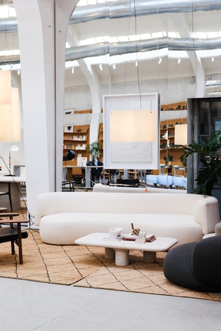
«Cloud Dancer» is particularly effective in interiors, according to Elle Decor. Eiseman describes the colour as ideal for rooms in which function and feeling merge. With round furniture, soft textures and airy designs, it creates a calm, minimalist atmosphere without appearing sterile.
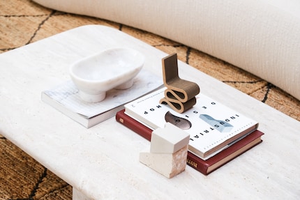
If you live in a rented flat and haven't yet dared to paint walls anything other than white: So now you're bang on trend. Interpret it for yourself - with furniture, decorations or art. Pantone provides a whole selection of colour palettes to help you harmoniously integrate the non-colour into your home.
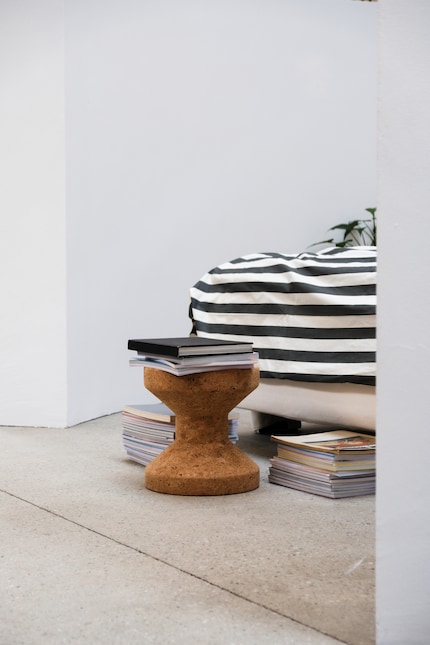
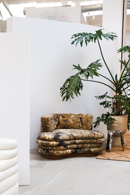
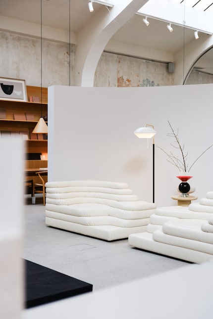
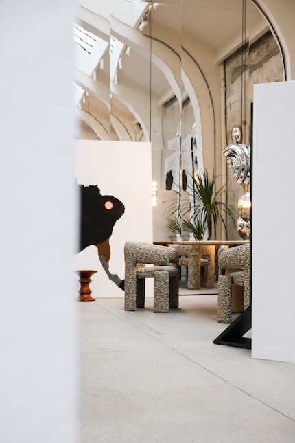
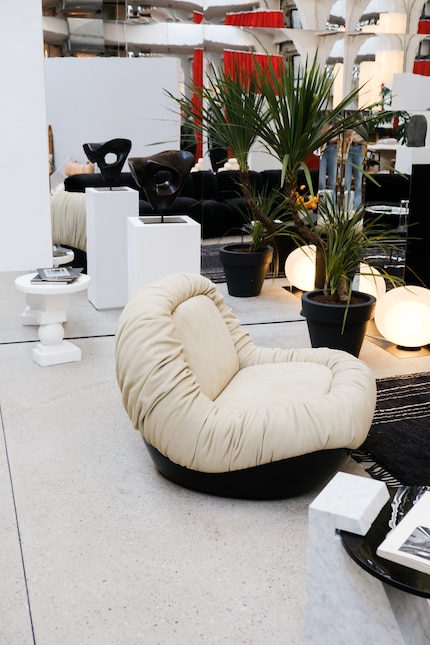
But white is not only a topic at Pantone. Interior professionals also emphasise how versatile the colour can be. The Italian interior design company Mohd (Mollura Home Design) proved this back in 2023 with the exhibition «Mohd Sinfonia» during Milan Design Week. The installation, designed by the renowned Nichetto Studio, skilfully showcased white and demonstrated how the colour can unfold in interiors with design, textures and shapes.
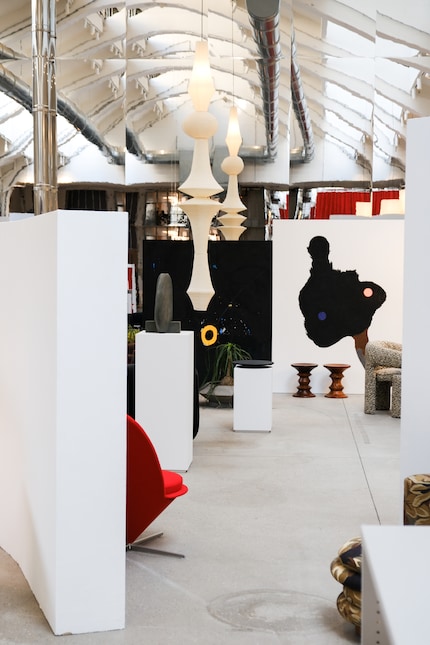
This year, understated colour once again took centre stage for Mohd at Milan Design Week. With its installation «The Mohdernist», the brand presented its modern vision of living.
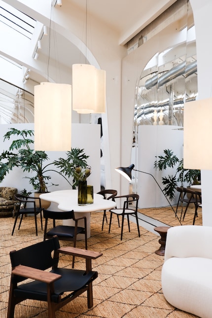
White walls, mirrors and a light-coloured floor characterise the atmosphere of «The Mohdernist». The exhibition celebrates the diversity of home decor by combining different furniture styles and shapes to create a harmonious overall picture. And this is carried by the lightness of the bright colour tone.
In an age characterised by complexity and sensory overload, «Cloud Dancer» invites you to pause for a moment. Whether revolutionary or not, whether as a neutral base or as a conscious design decision - it is precisely in the simplicity of this colour that its power to open up new perspectives lies.
What do you think about "Cloud Dancer"?
Like a cheerleader, I love celebrating good design and bringing you closer to everything furniture- and interior design- related. I regularly curate simple yet sophisticated interior ideas, report on trends and interview creative minds about their work.
Interesting facts about products, behind-the-scenes looks at manufacturers and deep-dives on interesting people.
Show all